Navigating data: designing a user-friendly data overview platform
Role
Design lead
Client / Company
CoreLogic
Deliverables
UX, wireframes, prototypes, UI
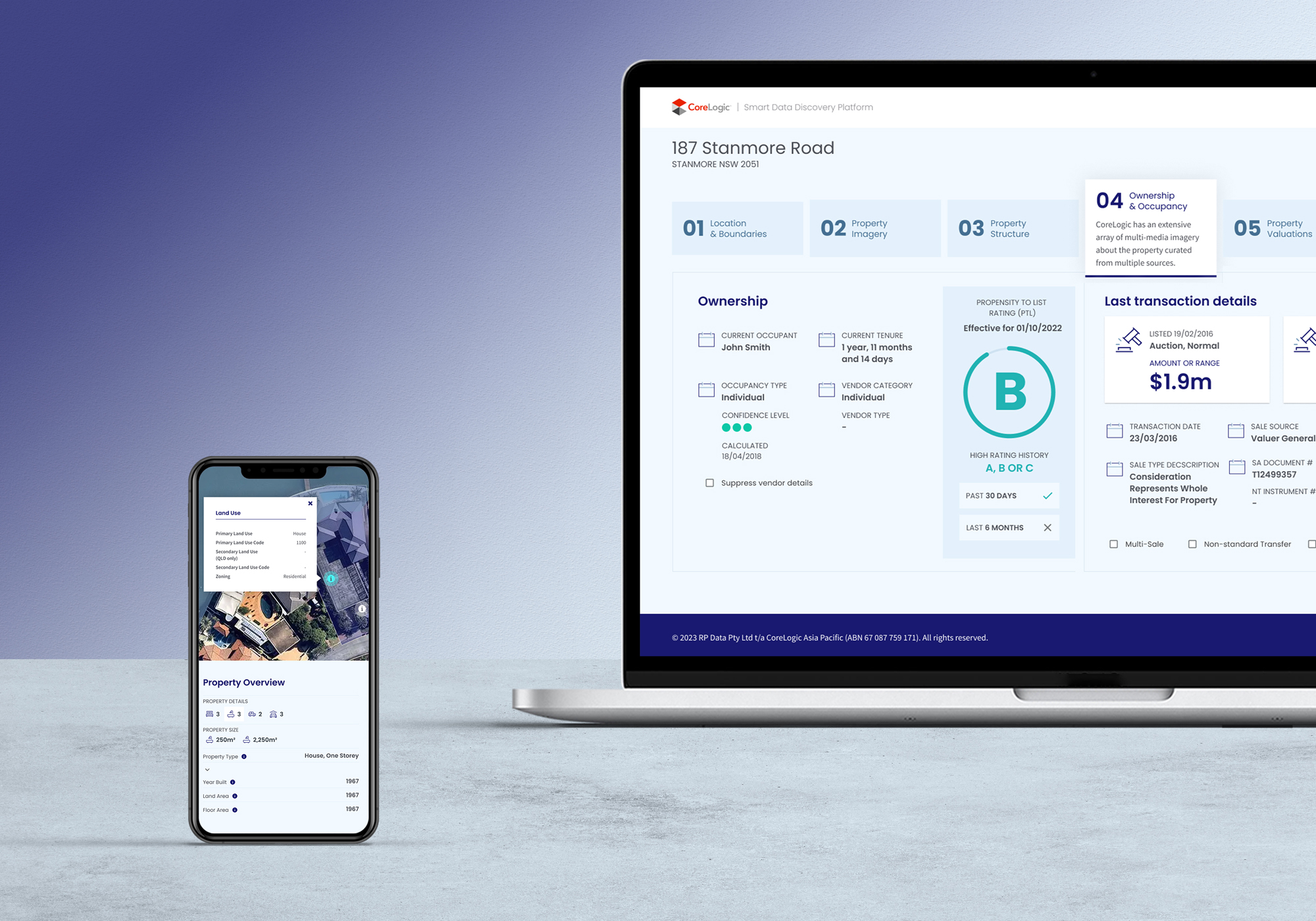
The Smart Data Discovery Platform is a digital platform developed by CoreLogic with the goal of helping users easily access and understand the full range of data offered by the company and available through it's numerous product offerings.
As the lead designer, my role in this project involved defining and scoping the problem, collating and drawing insights from relevant research, wireframing and prototyping solutions, and designing a user-friendly interface that would allow users to quickly navigate the platform, search for relevant data, and view detailed information about the different data available. Through a human-centered design process, we were able to create an intuitive and visually appealing platform that meets the needs of our users, while also showcasing the breadth and depth of CoreLogic's data offerings.
The platform has been well-received by both internal stakeholders, the sales team which now uses this regularly, and external users. It has proven to be a valuable resource for anyone looking to explore and leverage the wealth of data available through CoreLogic.
Project scope and definition
The development of the discovery platform began with scoping the problem and conducting user research. This involved gathering insights on user needs and behaviors, pain points, and desired outcomes. We identified the key challenges faced by users, which we aimed to solve with the new platform. These challenges included:
Products and delivery channels confusion: Difficulty understanding the different data products and channels through which the data was available.
Difficulty understanding breadth of data: Difficulty in understanding exactly what information was available for a single property.
Product selection: Uncertainty about which delivery method or product would be the best fit for their needs.
Information overwhelm: Traditional methods of communicating this information, such as spreadsheets or powerpoint presentations with long attribute lists, proved to be difficult for users to understand and digest.
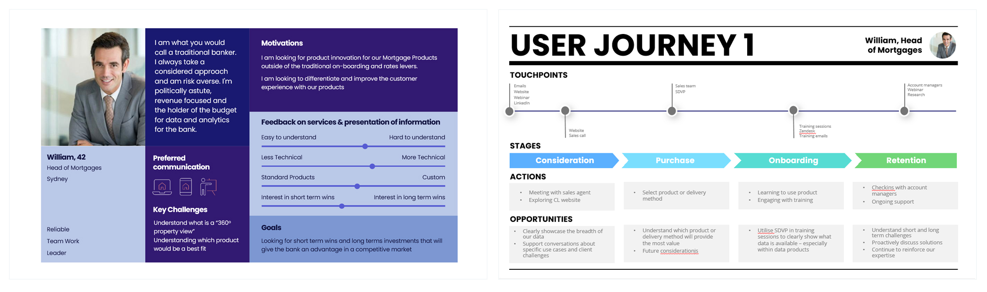
Persona and user journey mapping
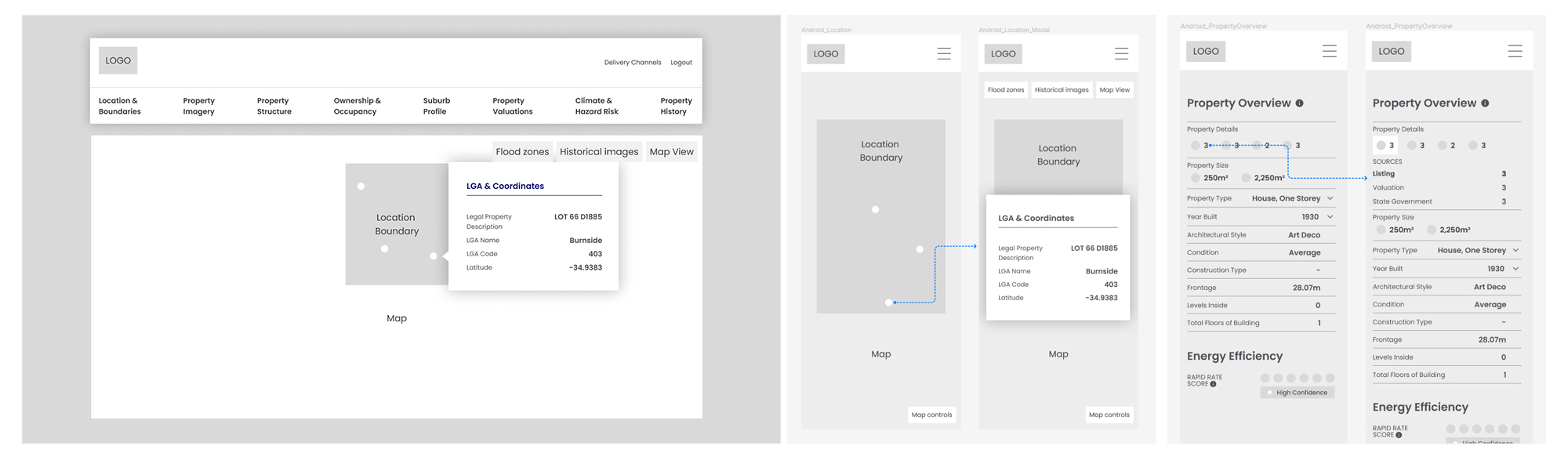
Information architecture and wireframes
Data attribute audit: in collaboration with the data team, we audited the data attributes available through different products and channels, creating a single source of truth and implementing an information hierarchy to ensure their grouping would make the information easy to digest for different audiences.
Wireframes: I developed wireframes to explore various design options and engaged with product, sales and engineering stakeholders to get early feedback. Based on this feedback, I iterated the designs accordingly to ensure they aligned with user needs and business objectives.
Wireframes
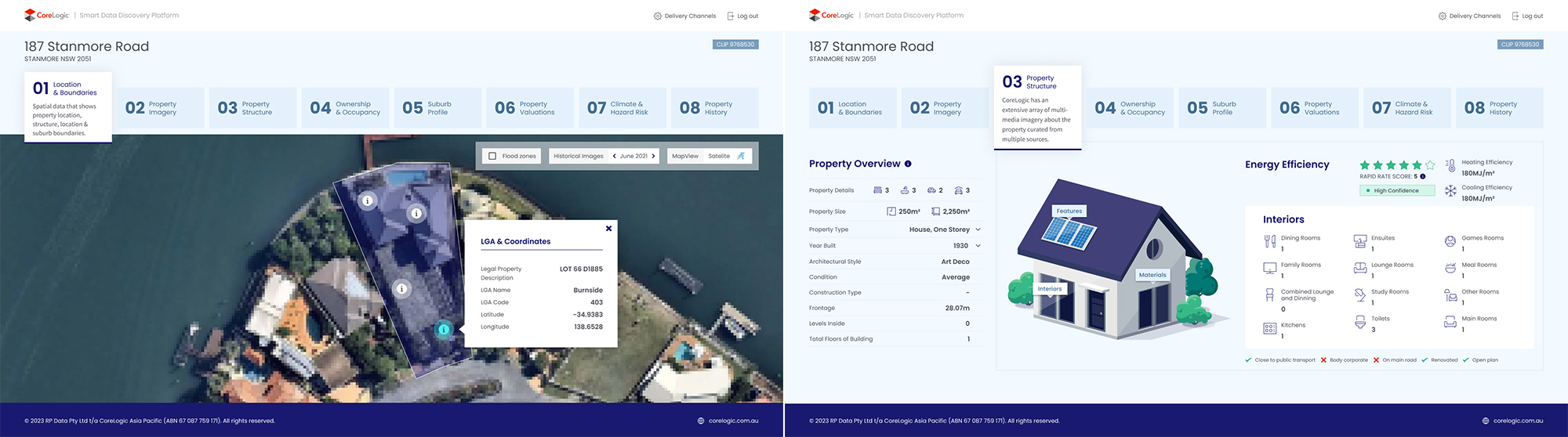
UI and design
Consistency of brand: To ensure consistency with the existing CoreLogic brand and design standards, we leveraged the design system created for the website project to design the user interface of the platform. This approach helped to streamline the design process and ensure a cohesive user experience across CoreLogic corporate products.
Agile approach: I worked collaboratively in sprints with the engineering team to meet delivery deadlines. Having an established design system to work with helped fast-track the design phase.
Clear, compelling design: The overall design of the platform focused on presenting the information in a clear and engaging way.
Overall, this process helped us to create a digital platform that is intuitive, user-friendly, and provides easy access to the full range of data offered by CoreLogic. By taking a human-centred design approach and working collaboratively with stakeholders and the development team, we were able to deliver a solution that meets the needs of both the business and users.