Unlocking improved UX and UI for leader in property data
Role
Lead Designer
Client / Company
CoreLogic
Deliverables
UX, wireframes, prototypes, UI, design system
CoreLogic Australia is a leading provider of property data, analytics and services to real estate, finance, and government sectors. Their website was outdated, with inconsistent design and complex user journeys. The website needed an overhaul to improve the information architecture and user experience.
I was the lead designer on the project, responsible for the interface and experience across devices, as well as collaborating with the development team on implementation and testing. I worked with an additional UX designer / researcher and UI / visual designer throughout the project. I have continued to work with the digital team on continuous testing, validation and improvements.
Project scope & definition
We started by understanding and documenting the needs of the business and key stakeholders. Identifying key problems from an internal perspective we defined the goals and success measures of the project. In collaboration with key team members and senior stakeholders we outlined the scope of work, project plan, deliverables, budget and timeline. Our development and engineering teams were involved from the start and we worked collaboratively thoughout the project.
We then went on to define the problems from our user's perspective. Working with our CX team we reviewed our user personas the wider journey maps, looking at how the website would fit in across all touchpoints. We reviewed the analytics available for the current site to review user behaiviour. We conducted both quantitative and qualitative surveys to help us gain further insights about user needs.
We identified the following key challenges the project needed to address:
Wide variety of segments: The website needed to cater to diverse segments, including real estate agents, construction companies, financial institutions, and government agencies. Each segment had unique needs and required a tailored experience.
Poor information architecture: The information architecture of the website was not well-organised, with information scattered across various pages. This made it difficult for users to find what they were looking for.
Complex user journeys: The user journeys on the website were complex, and users had to navigate through multiple pages to find the information they were looking for. This led to frustration, poor user experience and missed lead opportunities.
Inconsistent UI: The website had an inconsistent UI with different styles used across various pages. This created confusion, made it difficult for users to navigate the website and impacted the credibility of the organisation.
Business needs: The previous website was focused exclusively on online sales and did not cater to the pivoting business and brand strategies of the organisation.
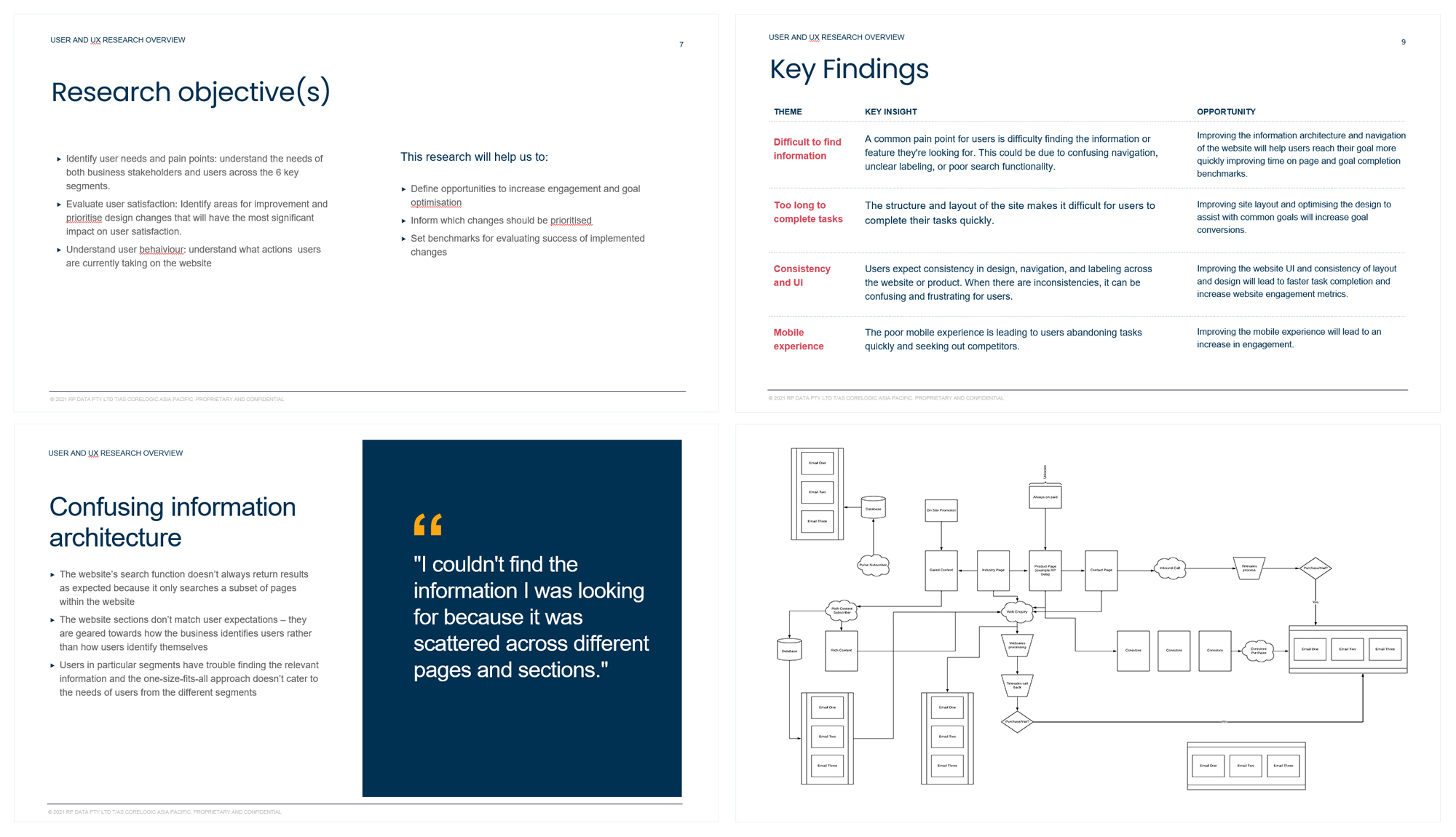
Research findings and user journey mapping - top left: research objectives, top right: key finding, bottom left: key findings expanded, bottom right: real estate user journey map across all touch points, showing where the website fits in across the wider CX journey.
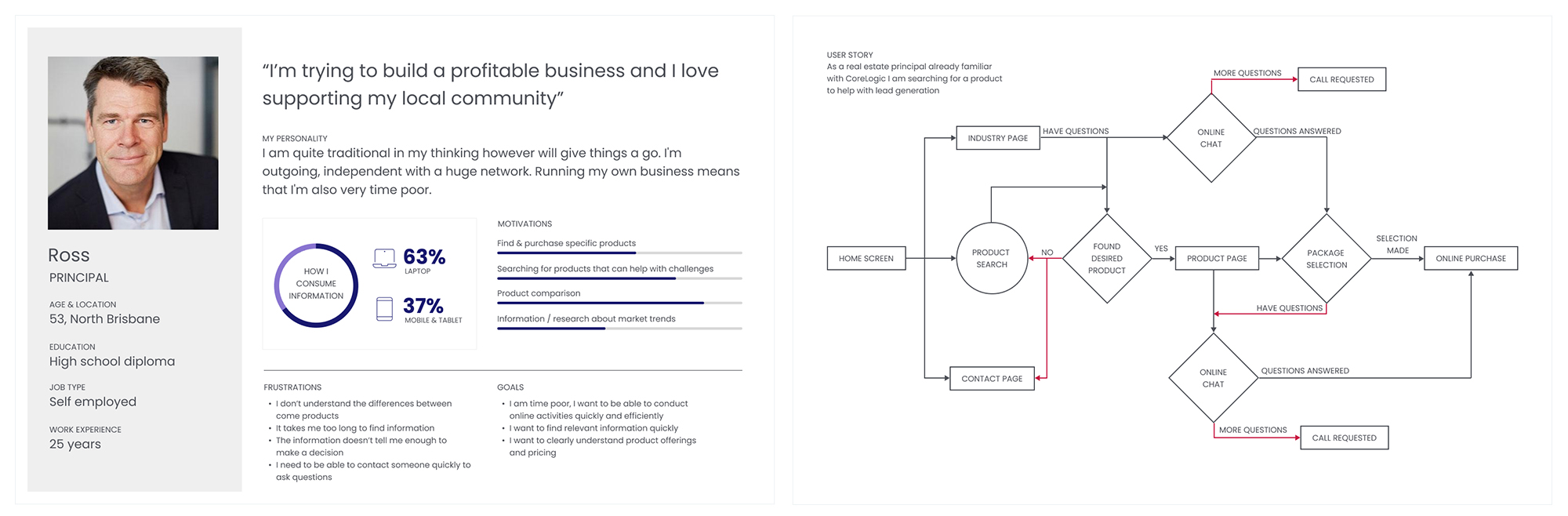
Persona summary and goal user flow
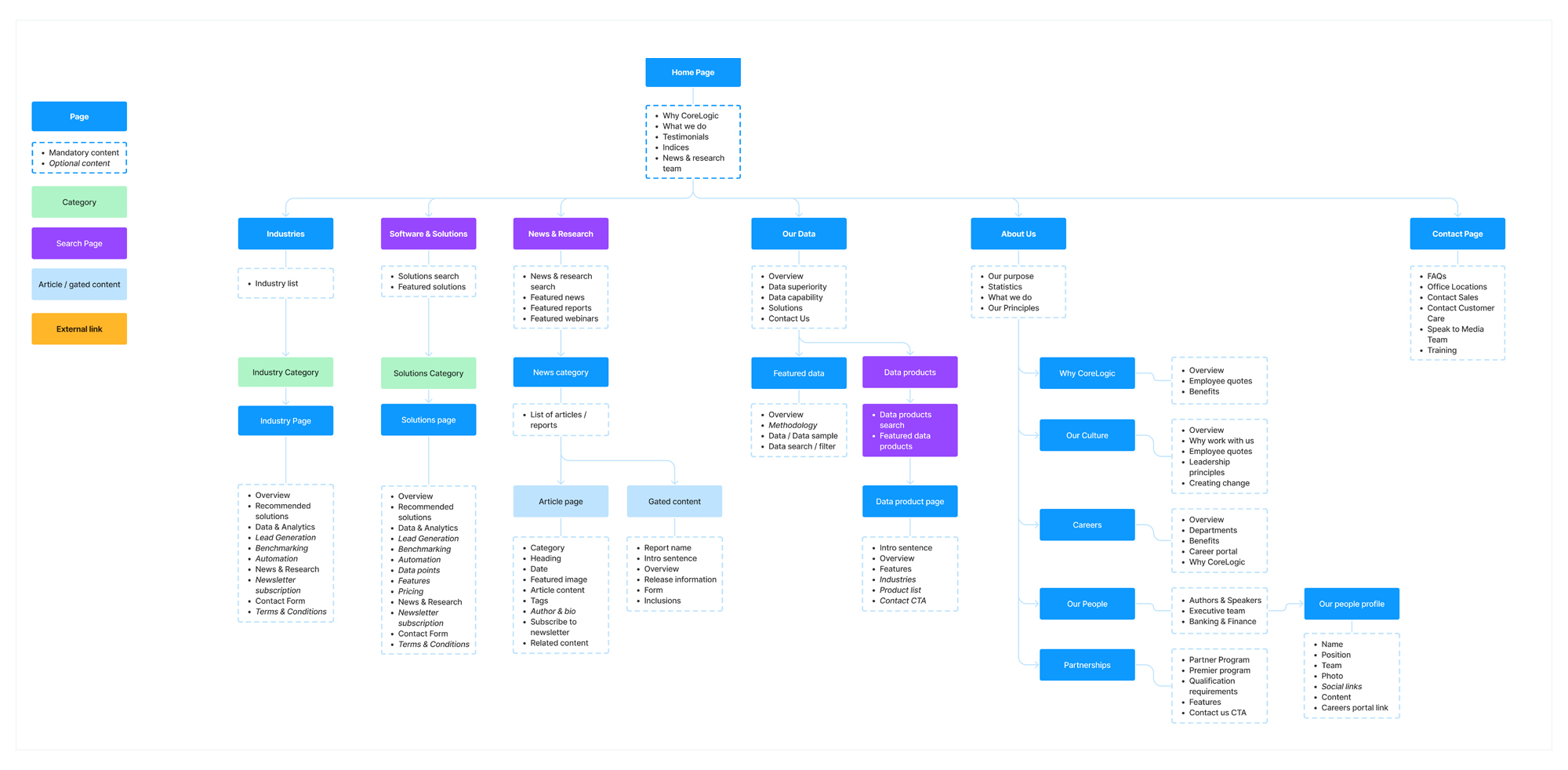
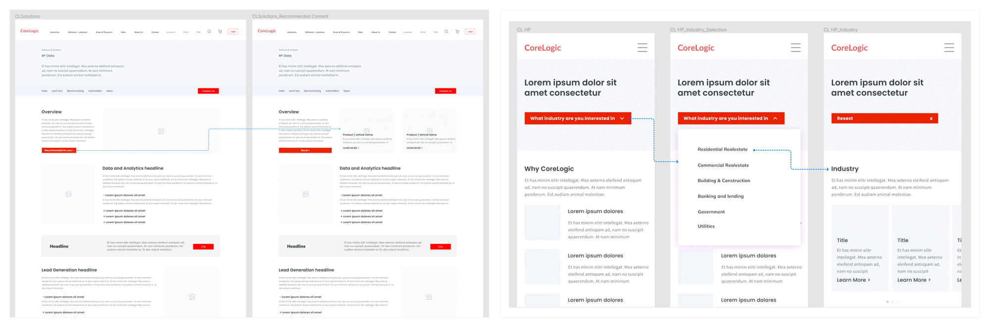
Information architecture and wireframes:
Audit: A UX, content and design audit were conducted of the existing website to identify useful content as well as redundant, outdated, or irrelevant content and design patterns.
Developing information architecture: Based on the research, audit and working closely with stakeholders, we developed an information architecture framework for the website, followed by a more detailed sitemap. Testing and feedback at this stage helped to refine and narrow the vast amount of information of the previous website, while improving the usability of the new website.
Wireframes and prototypes: We crafted low and medium fidelity wireframes to work through layout options and developed interactive prototypes to test user journeys, validate assumptions and iterated website structure.
Testing: We recruited users and customers to help test IA and prototypes, however we found that general users who lacked the background of our target audience sometimes struggled because they lacked the specific industry knowledge of some segments. While we did simplify some information, we weighted our customer's testing more in some instances.
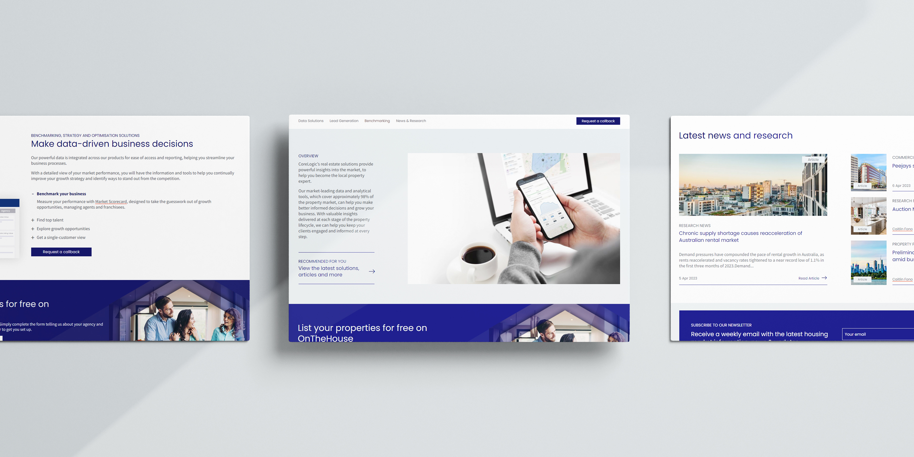
We introduced standard structures for key page types to bring consistency to the user experience, while being flexible enough to display the most relevant content for each audience. We simplified user journeys, reducing the number of steps users had to take to reach their goals or complete an action. While we wanted to continue to drive online sales in some segments, in other segments we wanted to be able to showcase the depth and breadth of our expertise, the page layouts needed to support both goals.
IA overview
Wireframes and medium fidelity prototypes
User testing overview
Design and UI
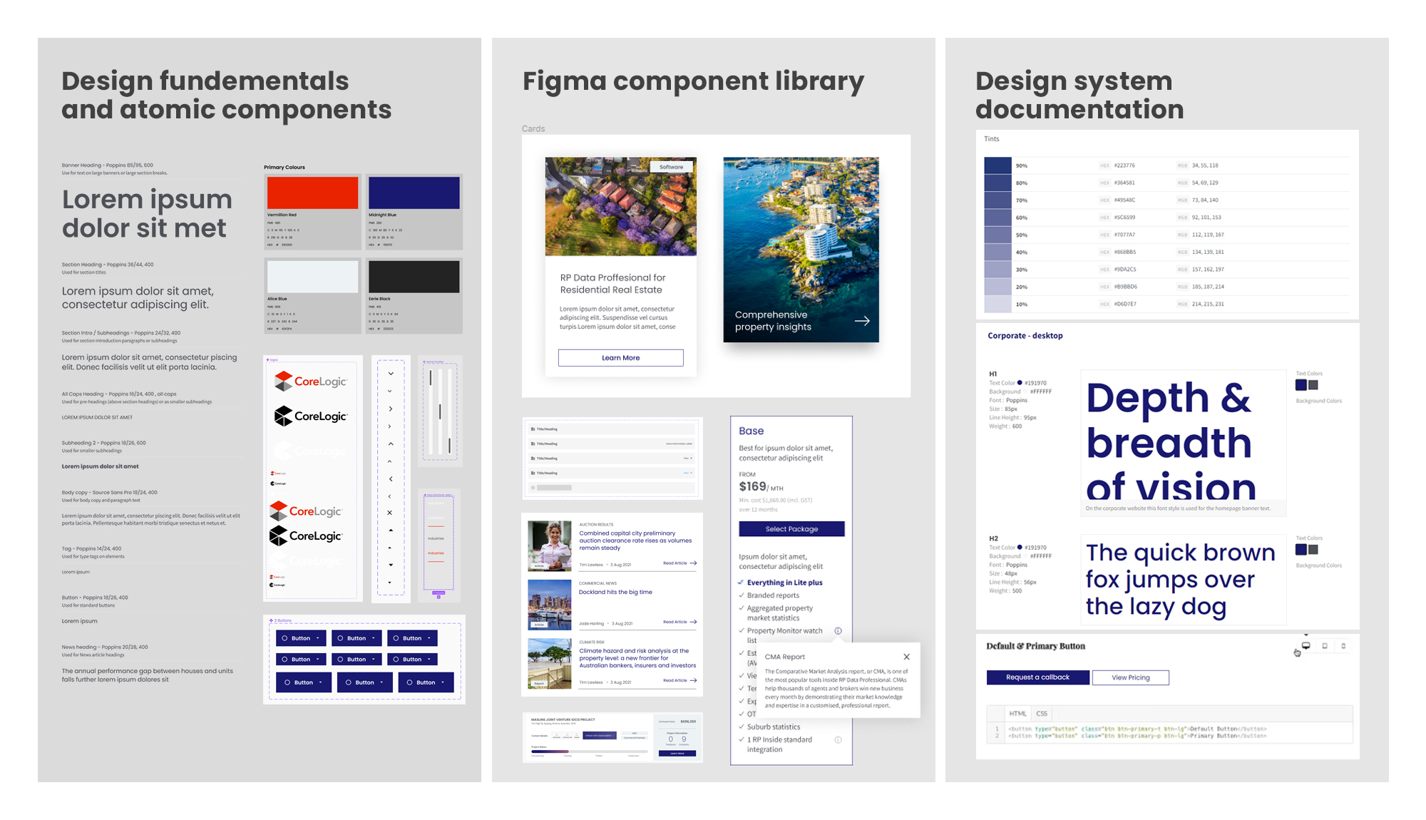
Design system: I led the development of a new design system that would unify the website's UI and create a consistent look and feel across all pages. This involved standardising icons, developing a typography heirarchy, and color palettes that were consistent with brand and accessibility standards.
UI and visual design: Having recently completed a brand refresh we wanted the UI to reflect the new brand and be in-line with the brand strategy, while enhancing the content and user experience.
Key design considerations:
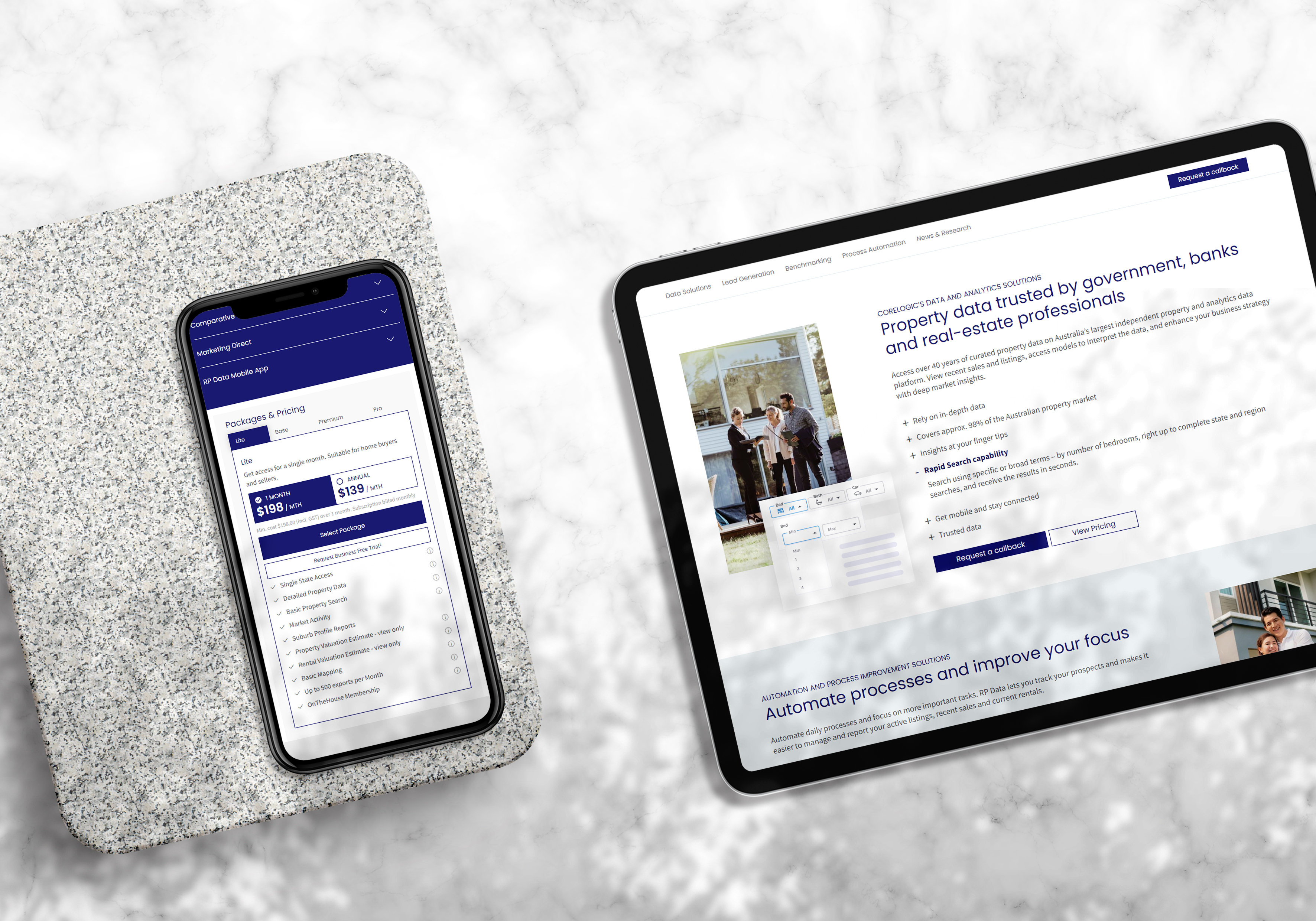
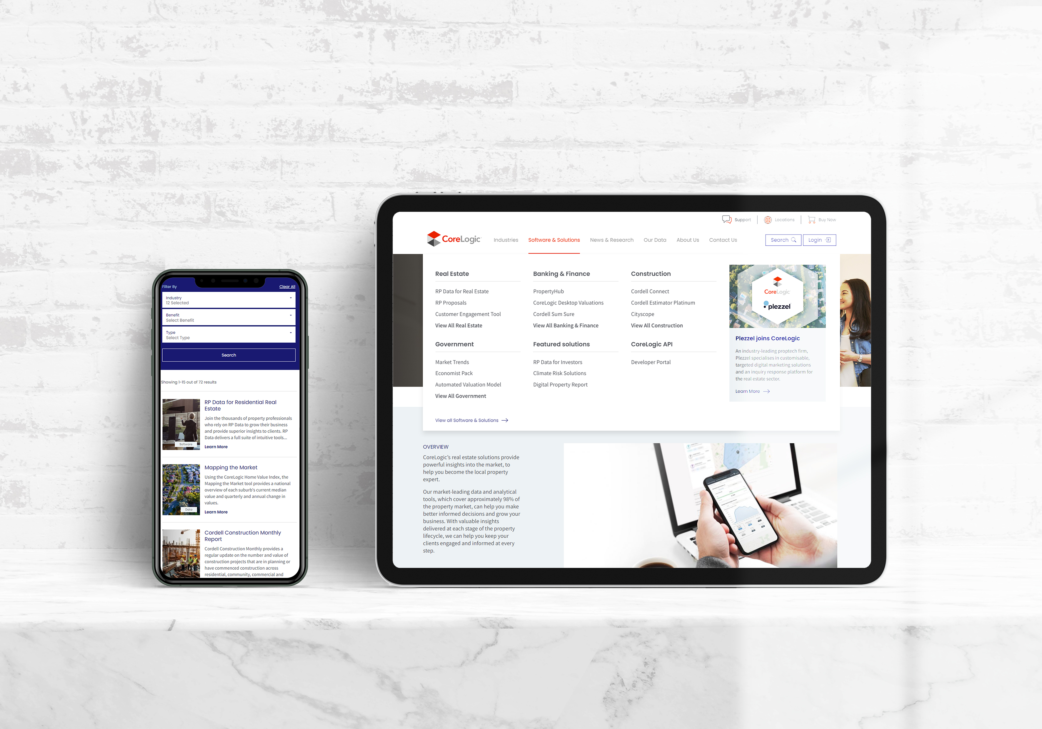
Responsive: Although according to our benchmark statistics a large proportion of our users looked at our site on desktops and tablets, we wanted to future proof the site and ensured designs were not only responsive but in some instances customised to smaller devices to ensure information was easily accessible and digestible, improving the overall user experience
Focusing the user: To make sure content was easy to digest and consume, we removed visual clutter, made actionable items clear and grouped related information together
Logic and design patterns: While we wanted our UI to reflect our brand, we also wanted to follow widely utilised design patterns so users could quickly take the actions they needed
Breaking up content: There is a lot of content that users can consume on the website, so it was important to break it up effectively and not ovewhelm the user with too much information at once, instead visually breaking up long information and guiding them through to other content options and actions
We built out a component library of common elements in Figma that could then be re-used and integrated into a corporate design system to ensure the future sustainability and consistency of the website.
From design fundamentals to design system documentation
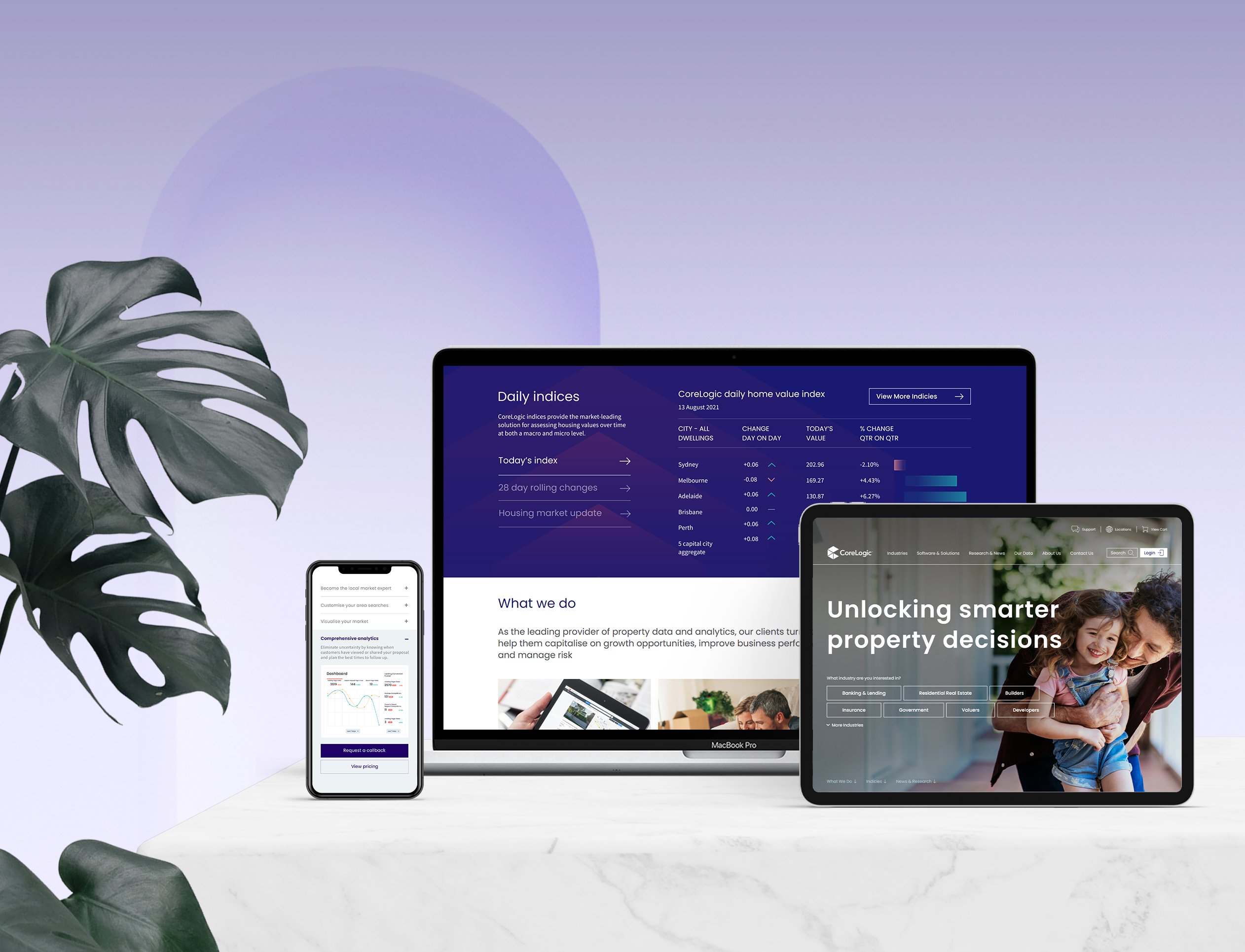
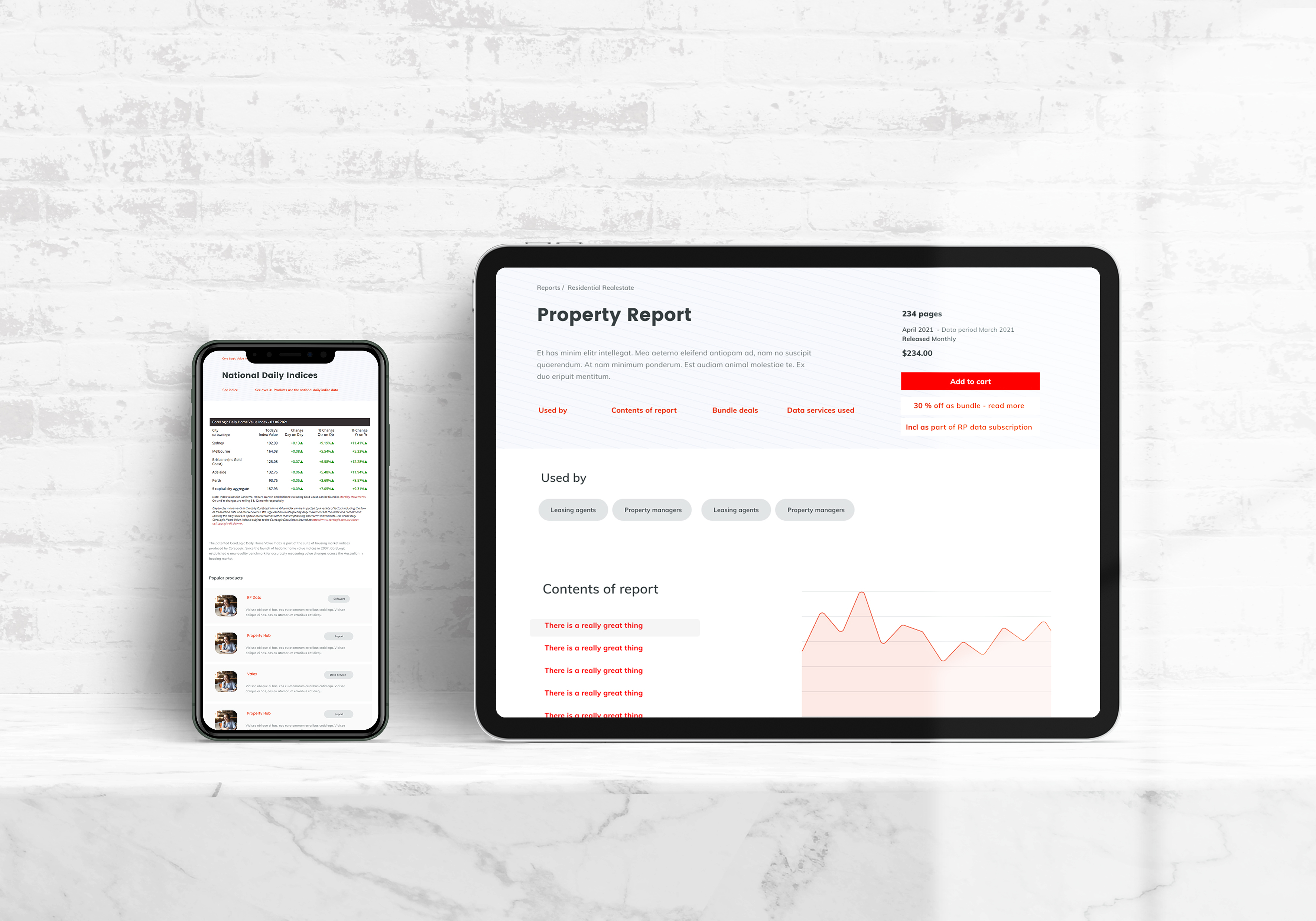
The designs were not only responsive but adapted to devices to ensure content could be easily consumed
We focused on making it easier for users to take the next best step through page layout, more intuitive options and customising content - such as news, research and product offerings, to be relevant to the specific segment and audience of different pages, compared to the one-size-fits all approach of the previous site.
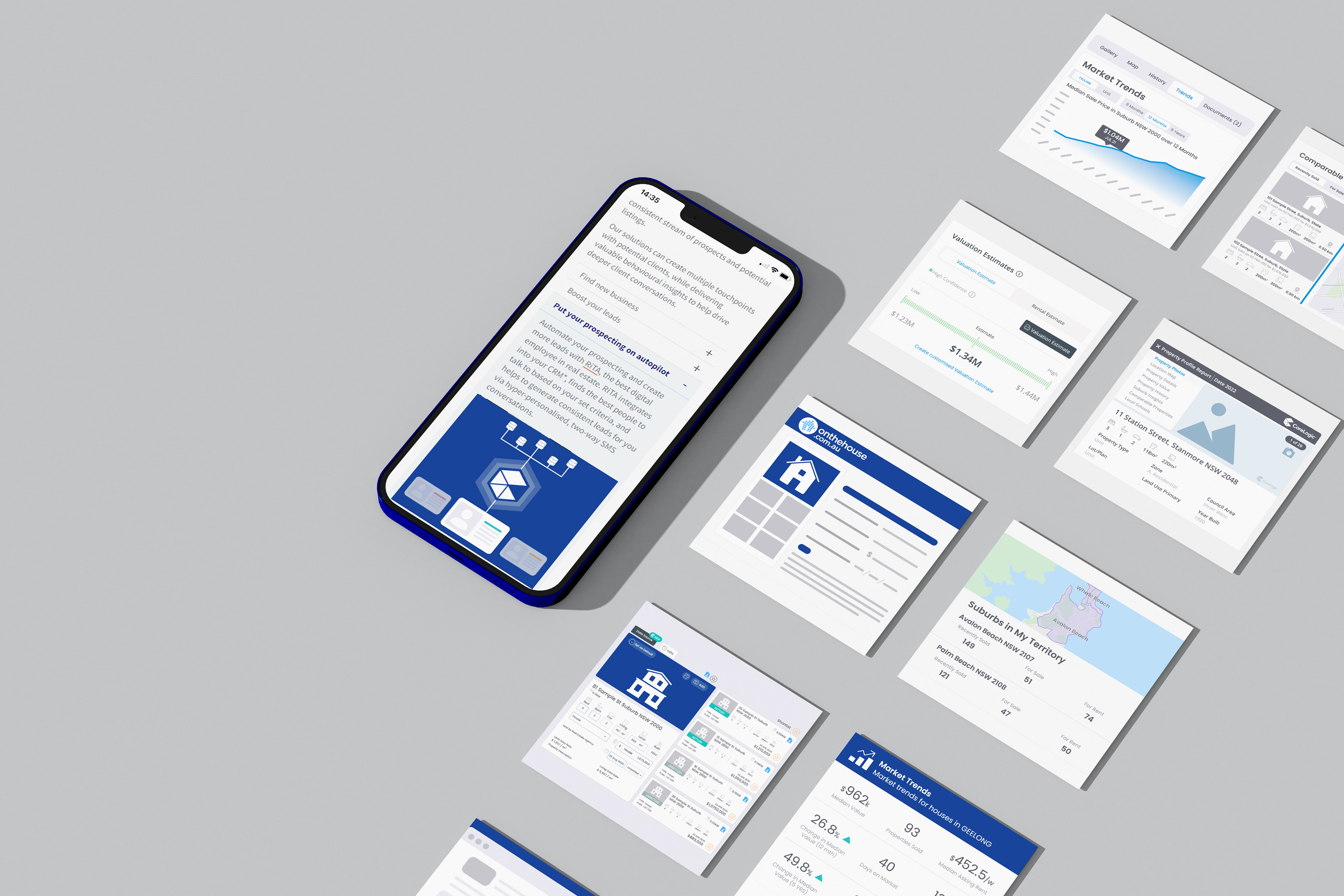
We developed a library of stylised user interface and conceptual illustrations to help quickly communicate key elements of a product user interface and other concepts about our data and products. This helped to standardise how our products and data were presented, allowed us to visually depict high-level concepts that did not correspond to a user interface and helped to focus the user's attention only on key and relevant elements.
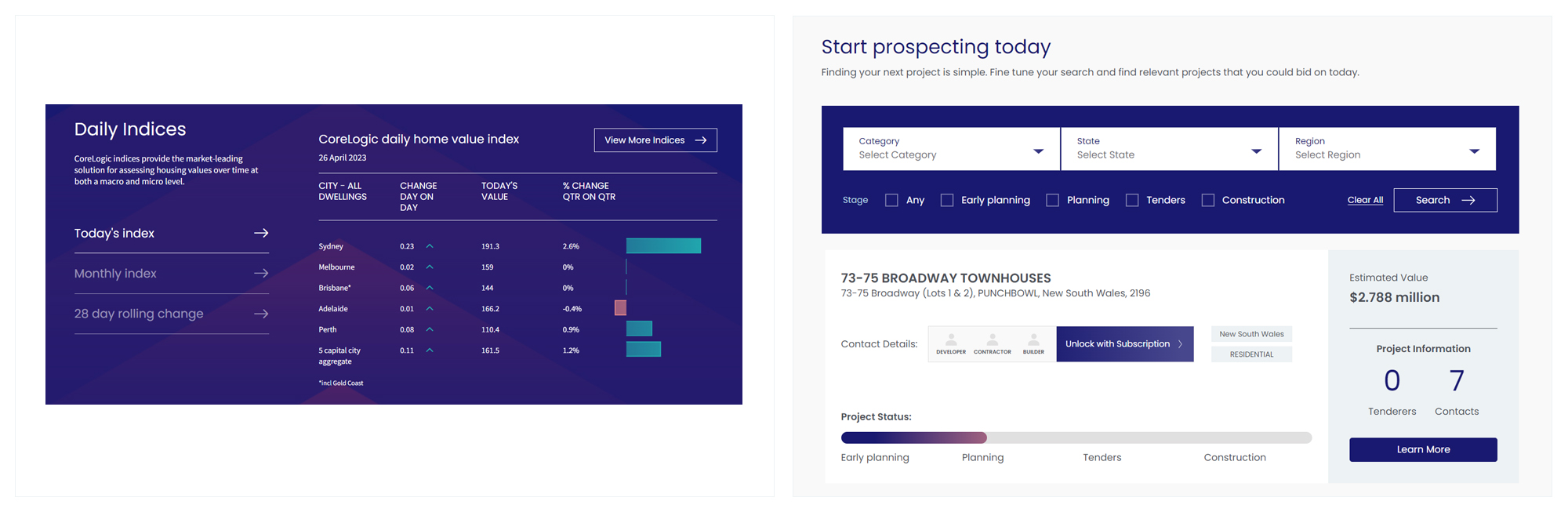
The navigation menu and product search have been designed to make information easy to find and filter, giving the users multiple ways to find relevant content
Interactive design elements help users quickly navigate to content relevant to them
Interactive components that allow users to get a taste of CoreLogic data and products
Development and continuous improvements
I worked with the development team to implement the new designs and ensure that the website was responsive and accessible across all devices. We supported QA and testing efforts providing feedback and support for testing.
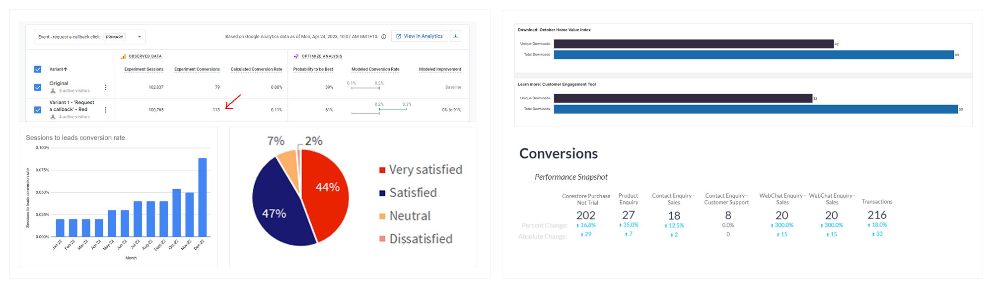
I continue to work closely with the digital team to track website analytics, conduct surveys and A/B testing to continue to improve the UX, UI and conversion rates of the website.
Working with key stakeholders and digital teams on ongoing improvement and testing
Results:
The website overhaul resulted in significant improvements in the user experience and user engagement. The new design system created a consistent look and feel across all pages, making it easier for users to navigate the website. This has also made the website easier to maintain, iterate and continue to improve on. The reorganised information architecture also made it easier for users to find what they were looking for reducing the number of low value calls to the sales team.
Throughout the 12 months post launch:
Leads have increased by 170%
Leads to conversion rates have improved by 75%
Session duration has improved by 40%
Sessions per user use have gone up by 107%
"It gave me great pleasure to see our new ‘shop window’ corelogic.com.au unveiled last month in Australia. Built for improved UX and performance, I think you’ll agree the refreshed design really reflects the evolving CoreLogic brand." - Lisa Claes, CEO CoreLogic International.