Harvesting insights for the NSW Department of Primary Industries
Role
Principal, Design Director
Client / Company
Beyond the Hedge
Deliverables
UX, persona definition, IA, wireframes, prototypes, design system, UI
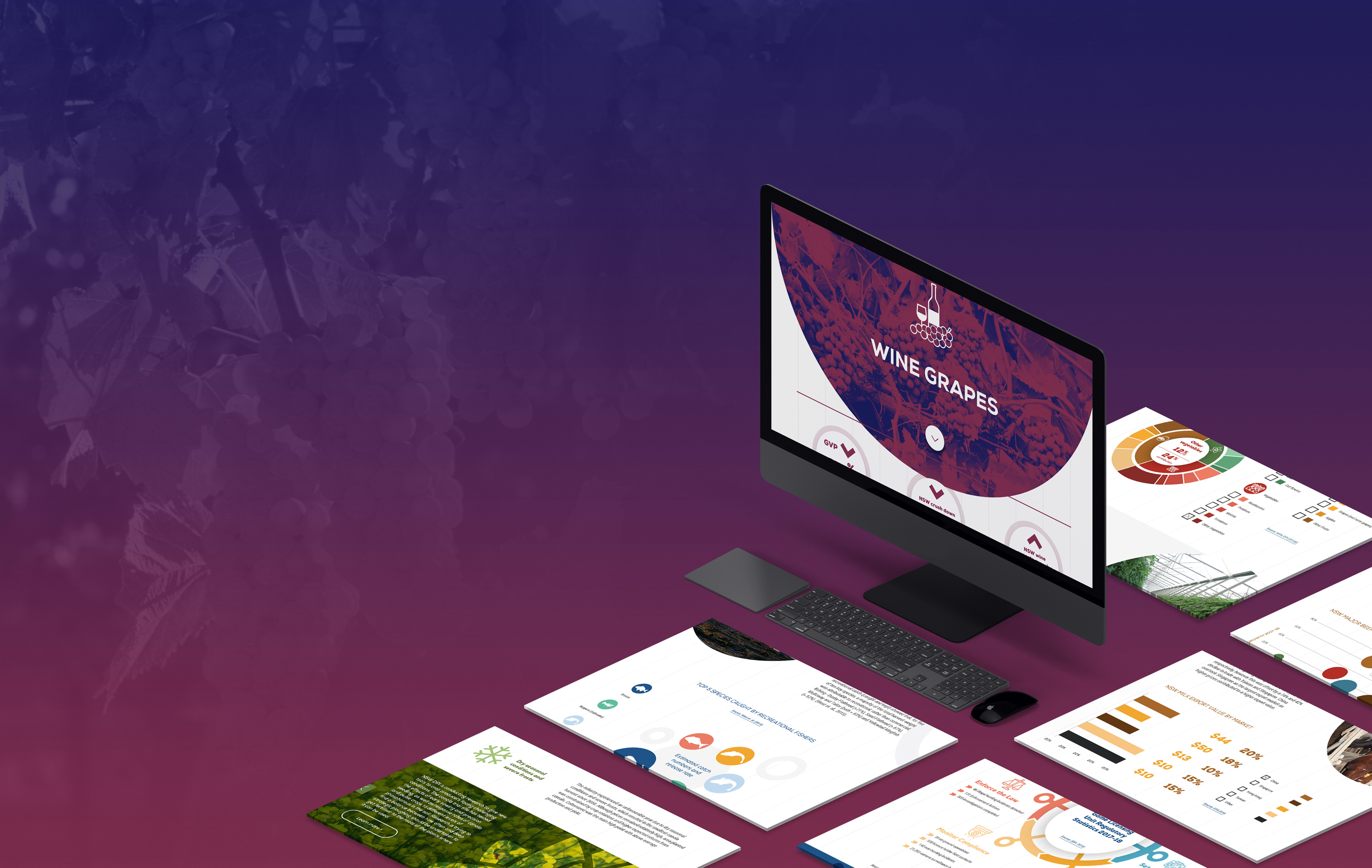
The NSW Government Department of Primary Industries (DPI) is responsible for promoting and supporting the sustainable development of primary industries in NSW, including agriculture, fisheries, and forestry. While principal at Beyond the Hedge, we won a tender to work with the department to showcase the economic output of these industries in an engaging data visualisation portal that would highlight the key statistics and trends of primary industries sectors each financial year. Our goal was to create an informative platform that would visualise the underlying strength and long-term viability of the primary industry sectors, while also providing users with easy access to important data and insights.
Project scope and goals
The project included both the online portal and a supporting printed publication. The key goals of the project were:
Engaging & interactive data visualisation: enhance the department's reputation as a reliable source for timely and relevant primary industries data and information, serving both internal and external stakeholders. We aimed to create a platform that would keep stakeholders informed and engaged with the DPI's achievements and the benefits being delivered to NSW primary industries.
Accessible & dynamic: The portal needed to meet a number of accessibility criteria, including WCAG & department standards, ensure data was easy to digest for diverse audience segments and cater to audiences with limited internet access. The data & portal also needed to be dynamic, integrating with the CMS used for the primary department website, so the department could continue to update it throughout the year as additional information became available.
Distilling complexity: The information and data presented in the portal needed to be easy to digest by different audience segments, providing value to both technical and non-technical audiences, and catering to different levels of education and training. High transparency was also very important to the department, ensuring call-outs and statements could be quickly verified by the data. It was also critical that the UI and design served and enhanced the content, and helped the user draw correct conclusions and inferences.
Research and information architecture
After scoping the project, our team focused on understanding the segments and audience for the project.
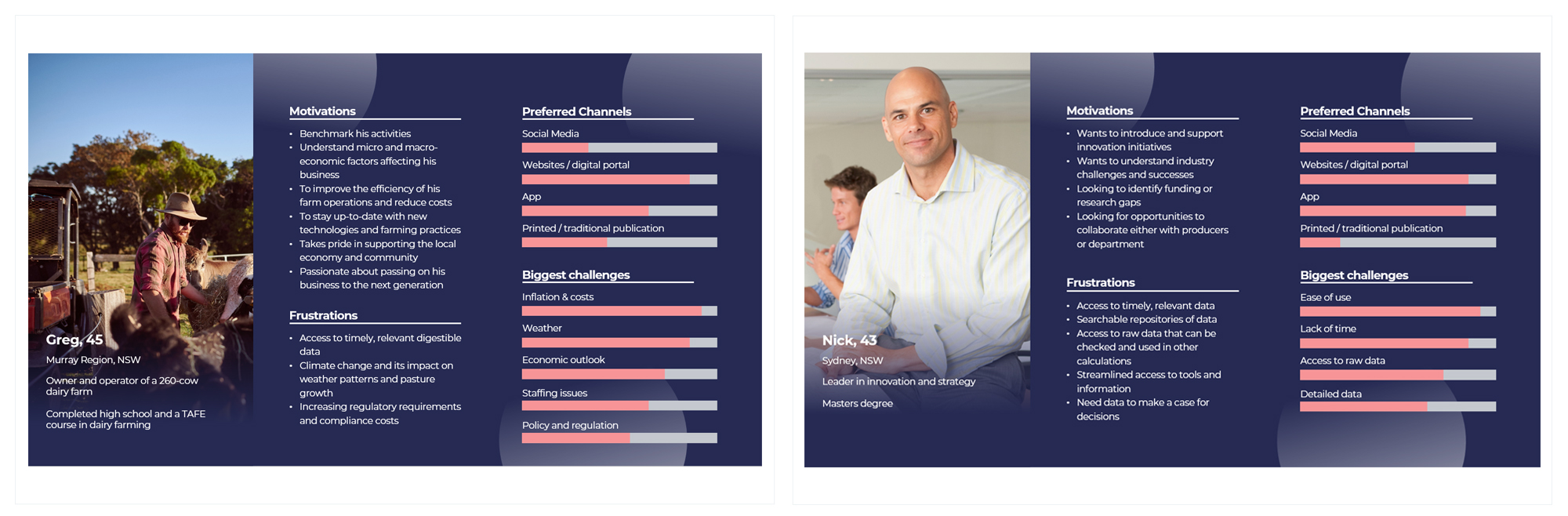
Audiences: The portal needed to serve two key segments - other government employees and departments looking for data about primary industries, business owners and other people working in or supporting primary industries in Australia. The two segments had unique needs which we mapped out in personas and user flows. Our design solution needed to make data and insights accessible and easy to digest providing both high level overviews as well detailed analysis.
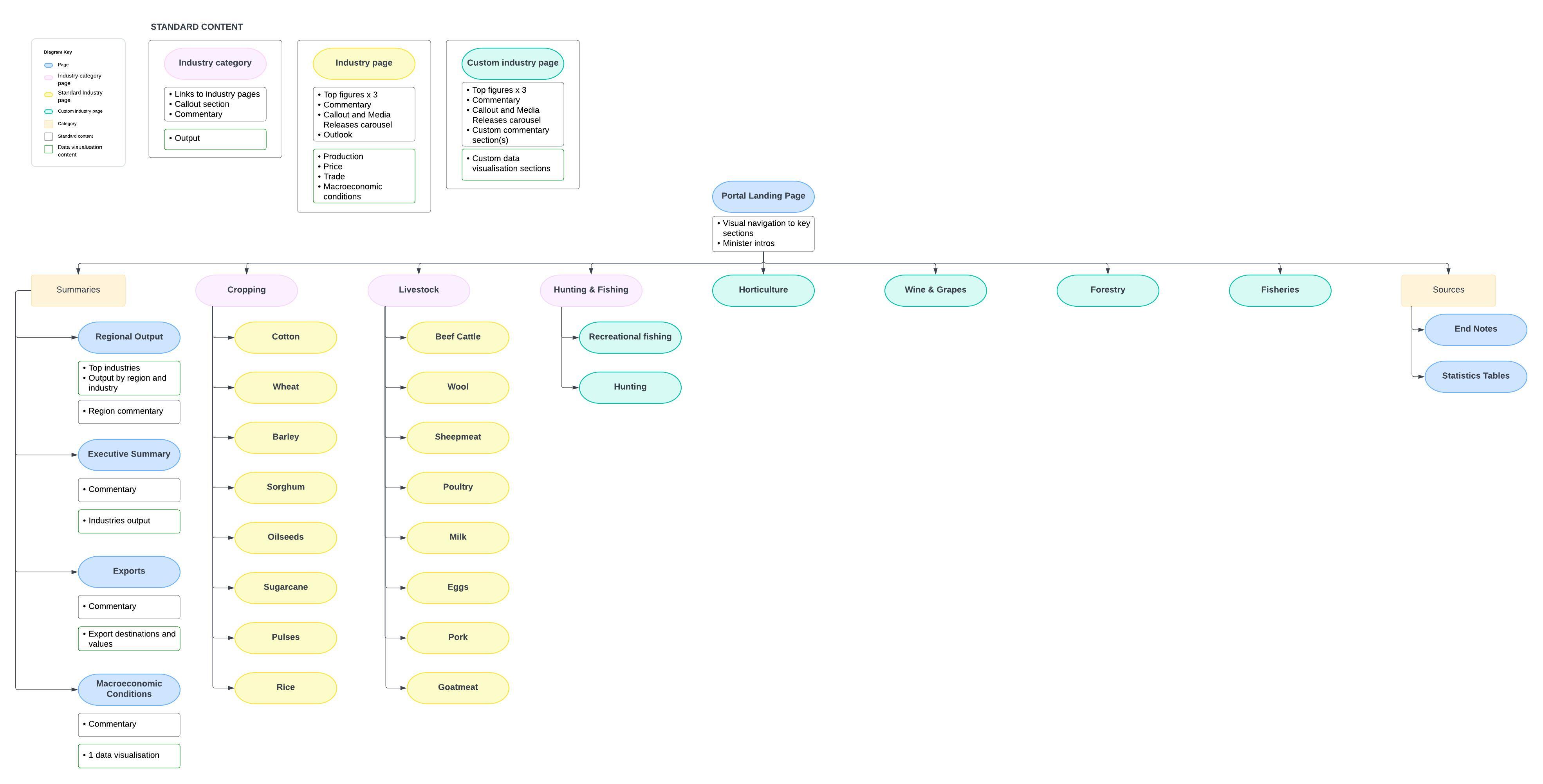
Information architecture: Based on the research and working closely with stakeholders, we developed an information architecture framework for the portal, followed by a more detailed sitemap.
Re-imaging the user experience: The department had not tried to create a digital portal like this previously, traditionally the information was delivered via static pdfs and brochures. Research, employing a user-centred approach and working closely with the stakeholders were essential to developing a cohesive and intuitive user interface.
Persona summaries
Sitemap
Design solution
Key design considerations throughout the project:
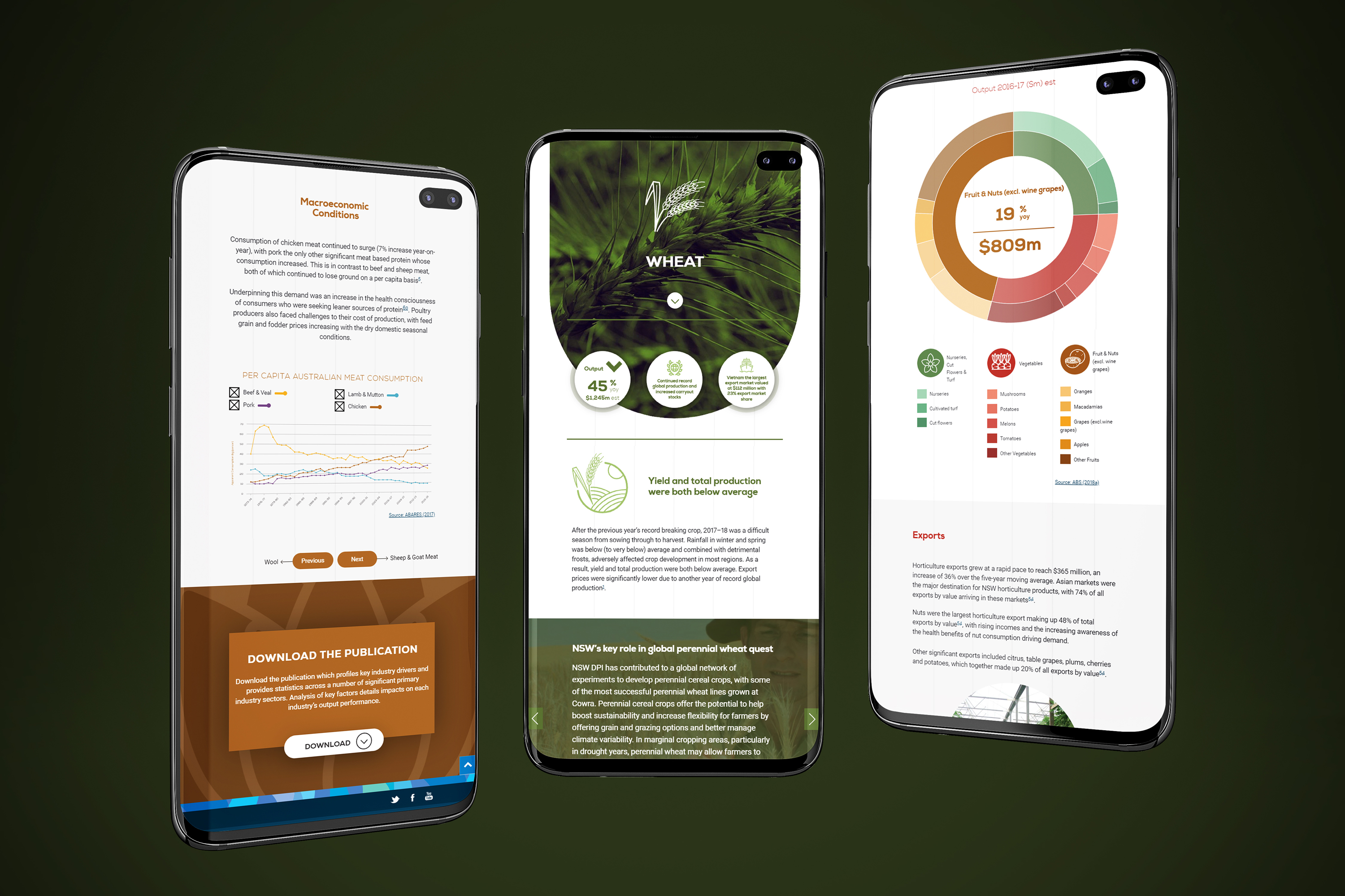
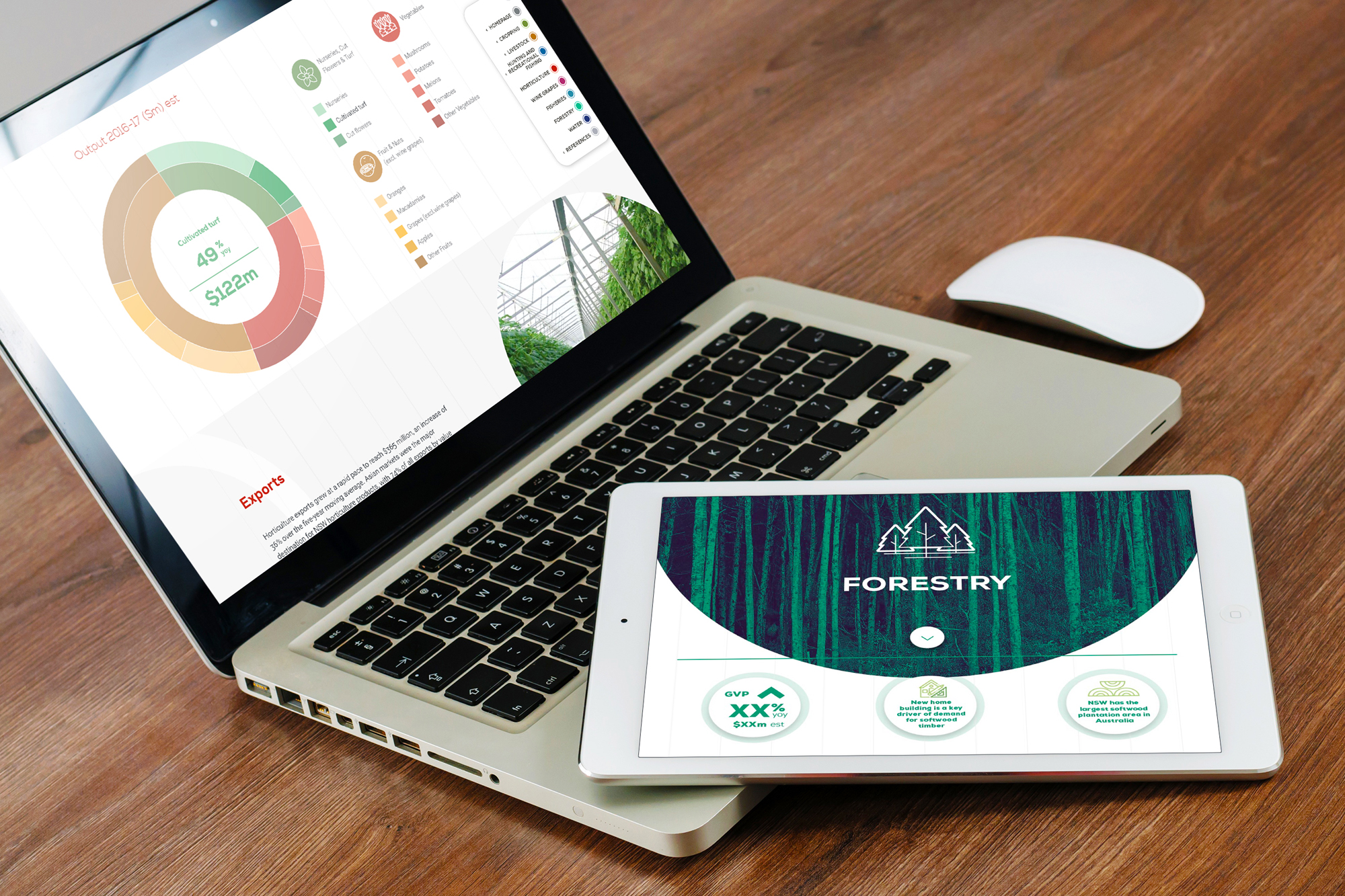
Accessible & inclusive: Designs needed to not just be responsive but work we well across a range of devices, ensuring data remained easy to engage with. The UI needed to support and enhance the data catering to audiences with different needs and backgrounds.
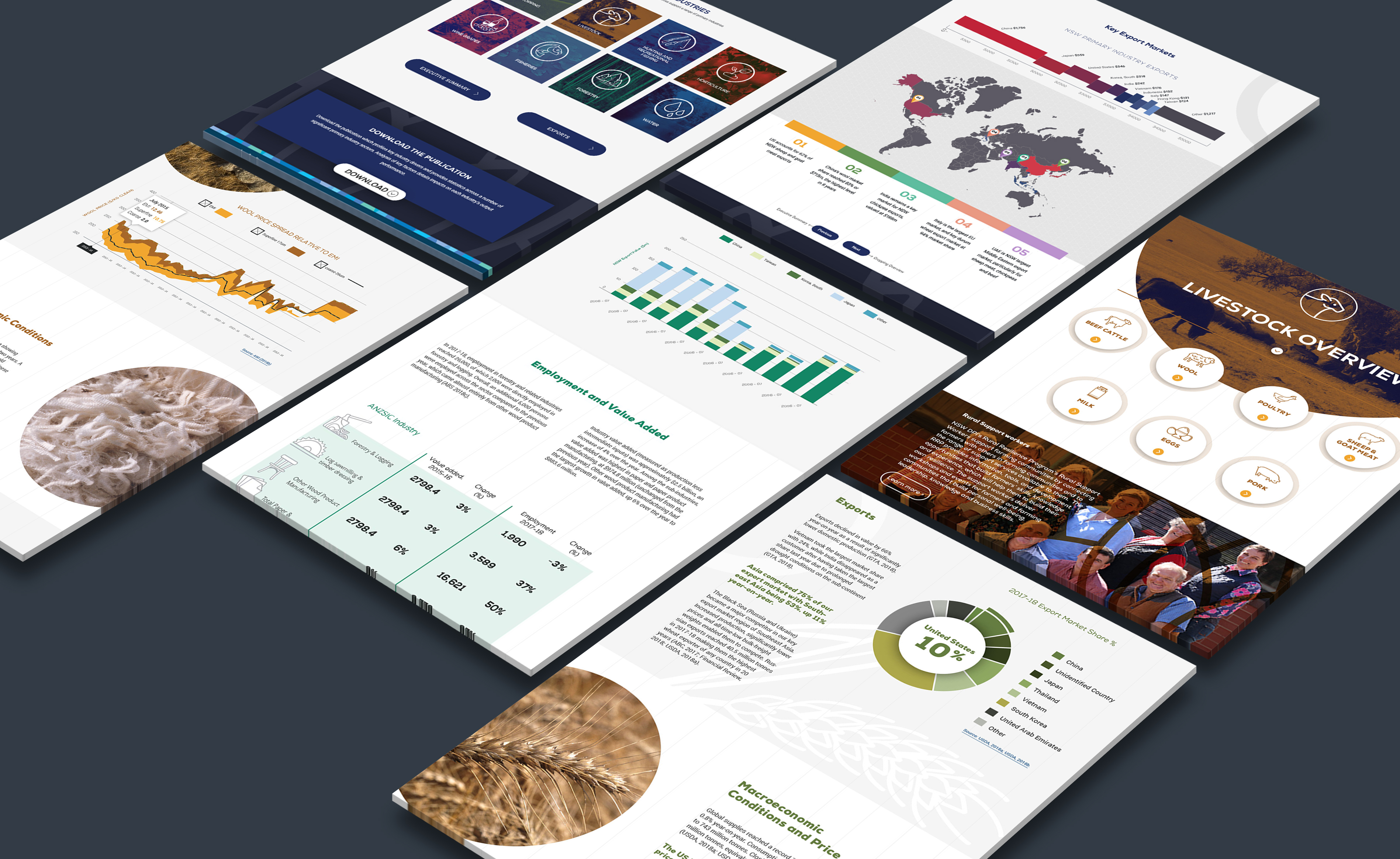
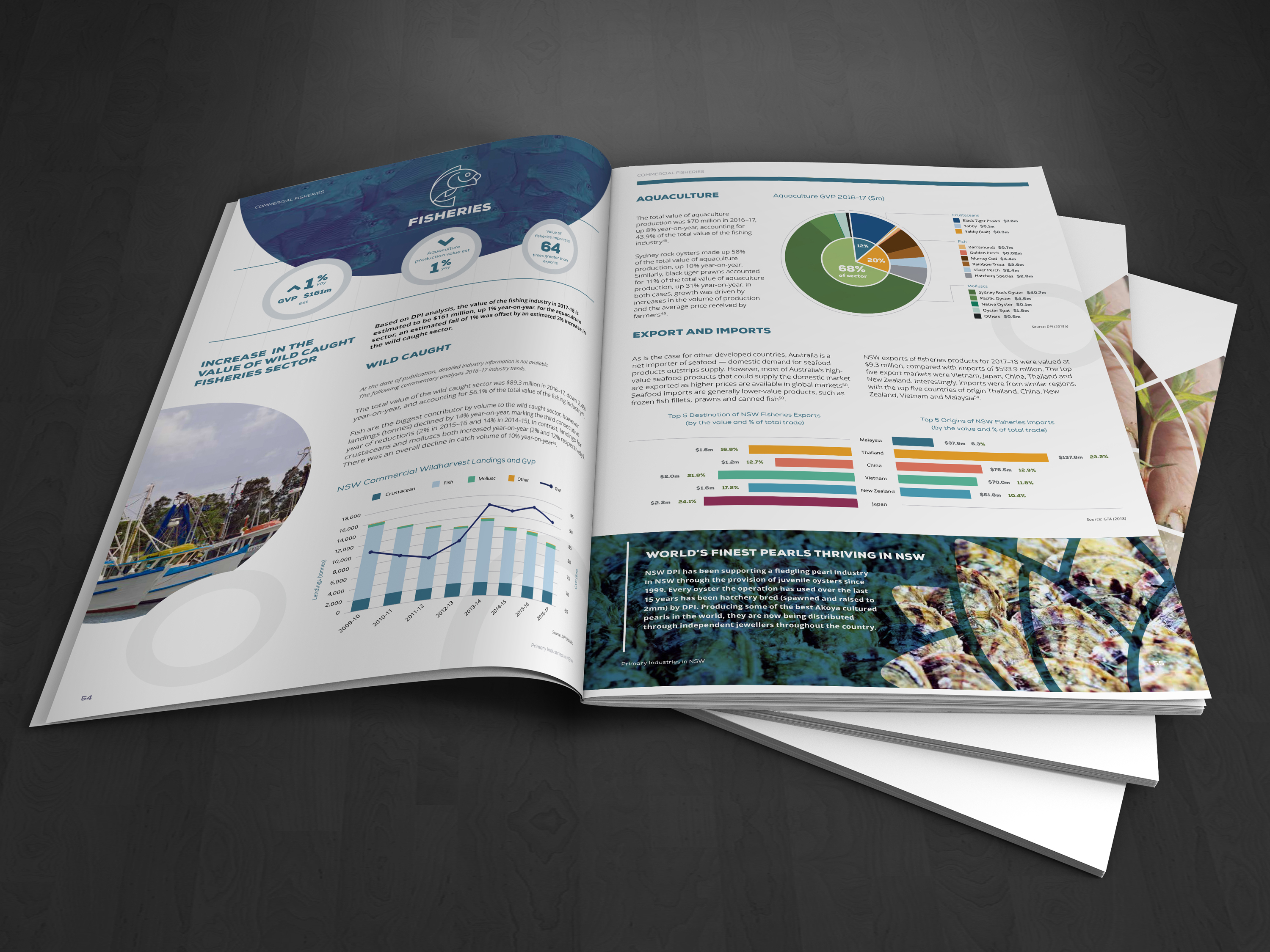
The right visualisation: It was important to select the right charts and other data visuals to communicate the information, making sure design choices did not distort the data or lead users to false conclusions.
Simple and focused: We wanted to keep the users focused and engaged with the content, ensuring the interface was clear and simple and the UI enhanced the content.
Colour selection: Colour choices have inherent connotations when it comes to data visualisation, we needed to ensure colour selection did not add unintended layers of meaning to the data.
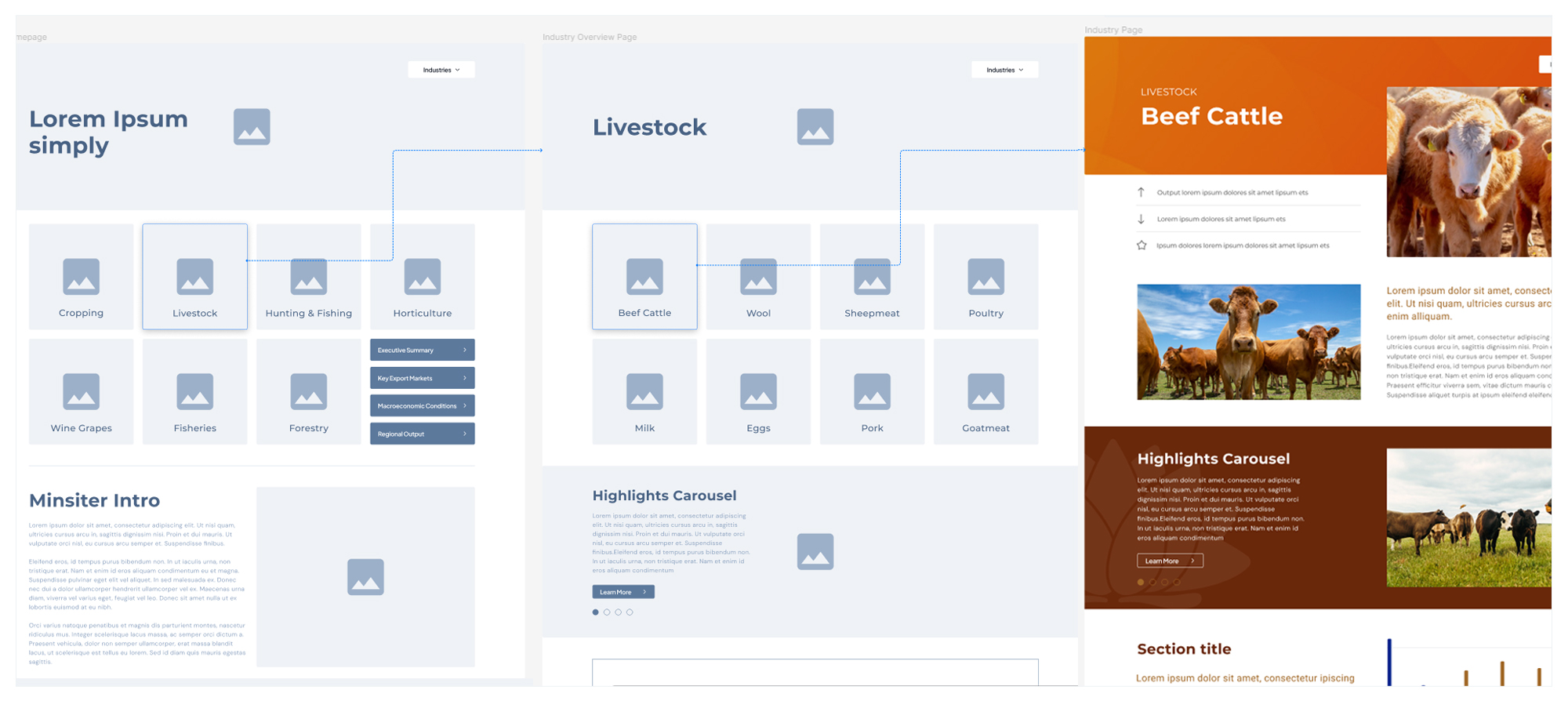
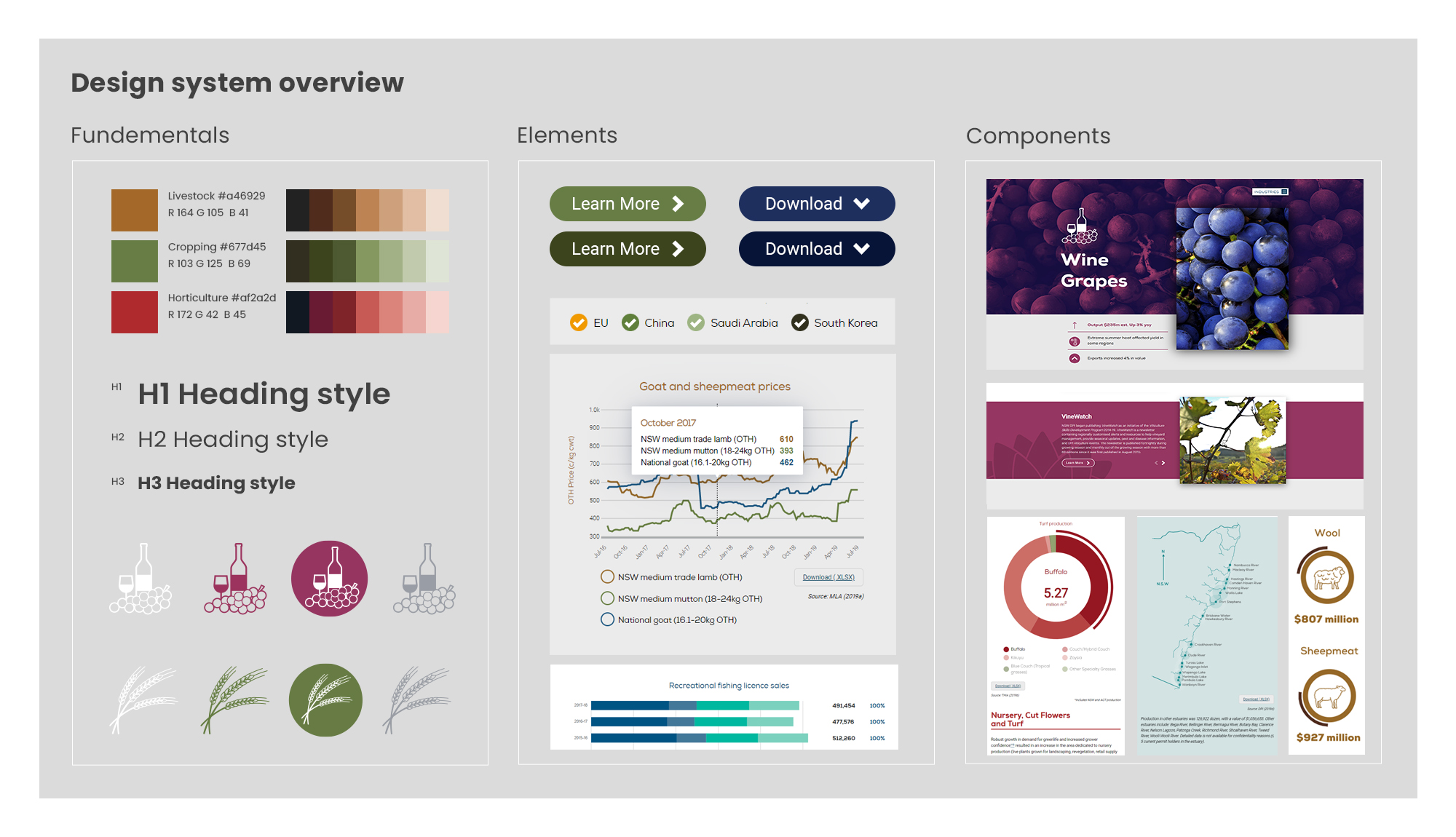
To effectively communicate our ideas to project stakeholders and test early assumptions, we developed wireframes and initial prototypes. We also created a component library and base design system to ensure consistency and efficiency throughout the design process. Our design approach focused on interactive visualisations of the data, making it easy for users to sort and filter relevant information, as well as download raw data for transparency.
We collaborated closely with the DPI's IT and technical teams to integrate our solution with their existing CMS and work within their framework. This ensured that our design solution aligned with the DPI's technical requirements and could be easily implemented into their system.
Results
Our initial outcomes received widespread praise, and the department tracking showed significant uplift in engagement with the data. We were awarded a tender to deliver the project for an additional two years. During this time, we continued to build and improve upon the design system, refining our approach based on user feedback and emerging trends in data visualisation. Our framework has stood the test of time and continues to be used by the DPI to this day.
We designed low fidelity, then mid fidelity, wireframes, to plan the layout, communicate ideas with stakeholders and test assumptions throughout the design process.
Building out a design system and component library helped us iterate year-on-year and provided a framework for the internal team to continue to make updates.
It was crucial that the data and platform overall remained accessible and easy to engage with across a range of devices. We also had to maintain a suitable user experience across a range of legacy devices and browsers.
Considered chart and data visualisation selection ensured data was represented to aid faster comprehension and make it easier to see trends and patterns.
The design made it easy for users to understand key highlights and trends about their industry and made the data easy to engage with
Portal insight were also summarised in a downloadable pdf and printed publication